What Is a Great Circle Route? Why Flight Paths Look Curved

Pull up the moving map on a long flight and you will notice something odd. The little plane is not flying in a straight line to its destination. On the India to North America routes, it curves up towards the North Pole, drifts over Russia or Greenland, then comes down the far side. It looks like a detour. It is actually the shortest way there.
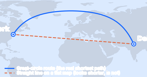
So what is a great circle?
A great circle is any circle you get by slicing a sphere straight through its centre. The equator is one. Every line of longitude paired with its opposite is another. The key property, the one that matters for flying, is that the shortest distance between any two points on a globe always lies along the great circle that joins them. Stretch a piece of string tight between two cities on a real globe and it traces a great circle. That taut string is the path a long-haul flight wants to follow.
For a fuller definition, see National Geographic and Encyclopaedia Britannica.
Why the shortest path looks bent
The confusion comes from the map, not the route. A world map is a flat sheet, but the Earth is a ball, and you cannot flatten a ball without stretching it somewhere. Most flat maps stretch the areas near the poles enormously, which is why Greenland can look as big as Africa when it is really a fraction of the size. On that stretched sheet, the genuinely shortest path gets pulled into a curve. Put the same two cities on a globe and the curve straightens out into the obvious shortest line.
The line that looks straight is the long way round
There is a second path worth knowing about, because it is the one your eye keeps wanting to draw. If you hold a single compass heading the whole way, fly permanently northeast, say, you trace what navigators call a rhumb line. On a standard flat map it looks reassuringly straight, a neat diagonal. The problem is that it is longer, sometimes a great deal longer, than the great circle.
Delhi to New York shows the gap plainly. The great-circle route the aircraft actually flies is about 11,755 km. The straight-on-the-map rhumb line is about 13,825 km, roughly 2,070 km further, an extra eighteen percent for the privilege of looking tidy. That is about two and a half more hours in the air. No airline would ever fly it. How big the gap gets depends on the route: Delhi to London, which runs more across than up, loses only about four percent to the rhumb line, so there the two paths nearly overlap. It is the far-north crossings that pay dearly for the flat-map version, which is exactly why those are the routes that arc so hard over the top.
You have probably already seen it
This is why a flight from Delhi to New York or Toronto heads north over Central Asia and the Arctic instead of running flat across the Middle East and the Atlantic. The polar route really is shorter. On the Delhi to New York great circle the aircraft climbs to around 70 degrees north at its highest point, deep into the Arctic, before curving back down towards the American east coast. The seat-back map is not glitching; that curve is the flight plan the airline filed and loaded the fuel for.
Which routes bend the most
How much a route curves depends on where it goes. Long flights that run mostly east to west at high latitudes bend the most, so Delhi to the United States or to northern Europe arcs clearly over the top of the world. Routes that run mostly north to south barely bend at all. A Delhi to Dubai or Delhi to Singapore flight looks almost straight on any map, because there is little distortion to fight. Short flights of any direction look straight too, simply because there is not enough distance for the curve to show.
Why real flights are not perfect great circles
The great circle is the target, but a flight plan is rarely allowed to trace it exactly, and it is worth knowing why the real track wanders a little.
- Wind. The jet stream is a river of fast air high over the mid-latitudes. Eastbound flights will happily bend a few hundred kilometres off the perfect line to sit in a tailwind, and westbound flights bend the other way to dodge the headwind. It is the same wind that makes your return flight often faster.
- Airspace. Some countries cannot be overflown for political reasons, and some regions carry extra fees or restrictions, so a plan sometimes steps around a country that the pure great circle would cross.
- Diversion airports. A twin-engine jet over an ocean or an ice cap has to stay within a set flying time of a suitable airport in case of trouble. On the emptiest stretches, near the poles or the middle of the Pacific, that rule can nudge the route away from the shortest line towards the nearest runway.
Add these up and the real track is a great circle with small, deliberate detours. It is never the flat-map straight line, which remains the longest sensible way to go.
Why the polar routes are newer than they look
It is easy to assume flights have always cut over the pole, but the far-north routes from India to North America are, in airline terms, fairly recent. For decades the airspace over the Soviet Union and, later, parts of Central Asia and China was largely closed to foreign carriers, so a flight from Delhi to the American east coast had to detour well south of the ideal great circle, adding hours. As that airspace opened up from the 1990s onward, and as aircraft gained the range and the twin-engine approvals to spend long stretches far from any airport, carriers could finally fly close to the true shortest path over the top of the world. So the polar arc you see on the moving map is not just geometry; it is geometry that politics and technology only recently allowed. It is a large part of why genuinely nonstop flights from India to the United States exist at all.
The distance you see is the great-circle distance
When the calculator on this site gives you a distance, that is the great-circle distance, measured the way the aircraft actually flies, not a ruler line across a flat map. Run Delhi to New York and you get about 11,755 km. Try a few high-latitude routes and watch how far north the arc climbs. Open the calculator and the map under each result draws the very curve you just read about.
So the next time the moving map shows your plane looping up towards the pole, you can sit back. It is not lost. It is taking the only shortest path a round world allows.